In today’s digital landscape, where mobile devices have become ubiquitous and mobile internet usage continues to rise, responsive web design has emerged as a fundamental aspect of successful online presence. With users accessing websites from a diverse range of devices, screen sizes, and orientations, the ability of a website to adapt and provide a seamless experience across all platforms is crucial. In this article, we’ll explore the importance of responsive web design in today’s mobile-first world and discuss the benefits it offers to businesses and users alike.
1. Ubiquity of Mobile Devices:
Mobile devices, such as smartphones and tablets, have become an integral part of everyday life for billions of people worldwide. From browsing the internet and accessing social media to shopping online and consuming content, mobile devices are the primary means of accessing the internet for many users. As a result, websites must be optimized for mobile devices to ensure that they are accessible and functional across all platforms.
2. Shift Towards Mobile-First Indexing:
In response to the growing dominance of mobile devices, search engines like Google have shifted towards mobile-first indexing, prioritizing the mobile version of websites over their desktop counterparts in search engine rankings. Websites that are not mobile-friendly may experience a decline in visibility and organic traffic, negatively impacting their online presence and competitiveness.
3. Enhanced User Experience:
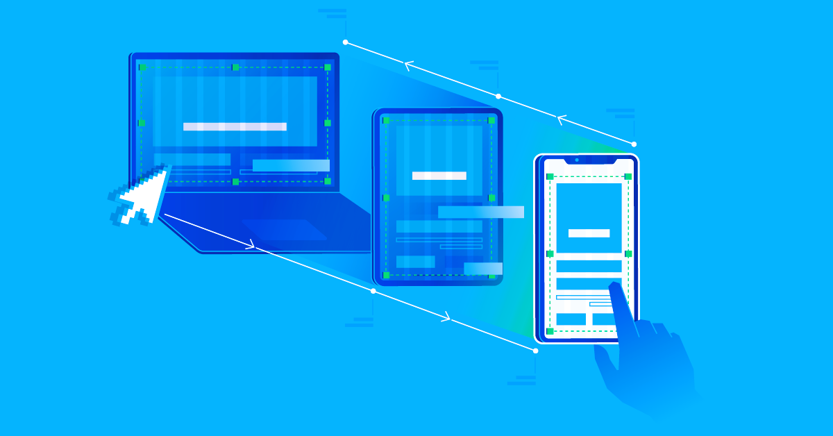
Responsive web design enhances user experience by ensuring that websites are easy to navigate, visually appealing, and functional on any device. By adapting the layout, content, and functionality of a website based on the user’s device and screen size, responsive design provides a consistent and intuitive experience across desktops, laptops, smartphones, and tablets. This leads to higher user engagement, longer session durations, and increased conversions.
4. Improved SEO Performance:
Responsive web design contributes to improved search engine optimization (SEO) performance by providing a single, unified website that is easier for search engine crawlers to index and rank. Instead of managing separate desktop and mobile versions of a website, responsive design eliminates the need for duplicate content and ensures that all traffic is directed to a single URL, consolidating link equity and improving SEO rankings.
5. Cost and Time Efficiency:

From a development perspective, responsive web design offers cost and time efficiency by eliminating the need to create and maintain separate websites or applications for different devices. By designing and developing a single responsive website that adapts to various screen sizes and resolutions, businesses can streamline their web development process, reduce development costs, and simplify ongoing maintenance and updates. Read about the importance of regular website backups in our article.
6. Future-Proofing Your Website:
In a rapidly evolving digital landscape, responsive web design is essential for future-proofing your website and ensuring its relevance and effectiveness in the long term. As new devices with different screen sizes and form factors continue to emerge, responsive design allows websites to adapt seamlessly to changes in technology and user behavior, ensuring continued accessibility and usability across all devices.
Conclusion
In conclusion, responsive web design is essential in today’s mobile-first world, where users expect seamless experiences across all devices. By optimizing websites for mobile devices, businesses can enhance user experience, improve SEO performance, reduce development costs, and future-proof their online presence. Embracing responsive design is not only a best practice but also a necessity for staying competitive and meeting the evolving needs and expectations of today’s users.
For more information on web standards and best practices for responsive design, visit the following resources:
By adhering to web standards and incorporating responsive design principles into your website development process, you can ensure that your website delivers an exceptional user experience across all devices, driving engagement, conversions, and business success.